Finpass

branding & graphic design

This fintech, specialized in credit, was renamed from "f(x)" to Finpass. Their design team needed a fast, energetic and easy recognizable brand to apply in the materials and also the brand's digital platform. After a lot of iterations, I came up with a balanced, vibrant and friendly logo, mixing the two main letters (F & P).

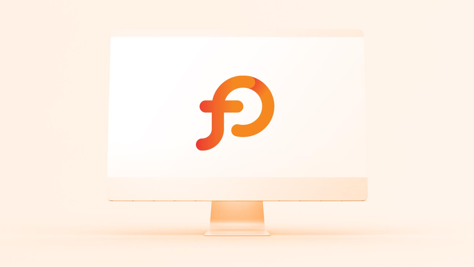
The color palette decision was strategic: I mapped their competitors and found that all these brands used pretty much the same hue. After seeing the hue map, the Finpass team was very enthusiastic and we invested in a different, more vibrant tone of yellow and orange.
Other projects: 
Vinicius Quesada

Designed by Vinicius Quesada